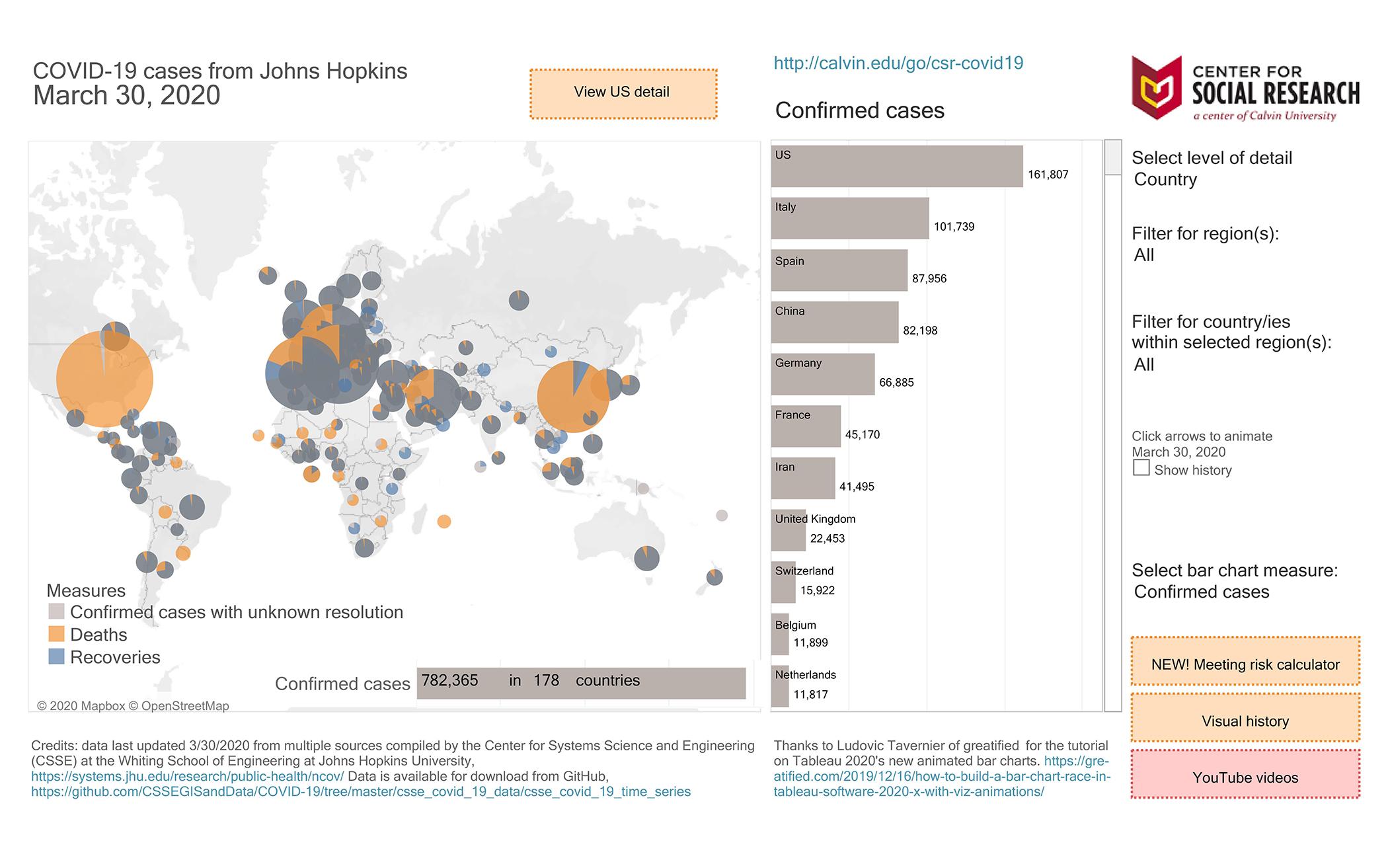
With the U.S. Centers for Disease Control, Health Canada, and the World Health Organization releasing daily data related to the spread of COVID-19, sorting through all that information to understand the risks is daunting. That is exactly why staff at Calvin University's Center for Social Research released a set of tools to help make the data more approachable.
“One of the things we like to do at the Center for Social Research is to make data accessible to people who may not be used to interpreting data,” said research specialist Keila Pieters, a member at Church of the Servant Christian Reformed Church in Grand Rapids, Mich. The center has published a set of tools on a public Tableau, set up like an Excel workbook, with each tab serving a different purpose. The team draws from data available from John Hopkins University and updates the tools daily.
The main tool is a visualization map that tracks the spread of COVID-19 animated over time. There is also an interactive graph called the meeting risk calculator where users can gauge the risk of meeting in small or large groups by entering the population and number of deaths of any geographical area.
“With COVID-19, if you have a meeting of 100 people, that risk calculator is giving you a warning of the compounding effect, that now you have an 11.5% chance that you have at least one infected person or a carrier in the room,” said Neil Carlson, the Center’s director, and a member of Shawnee Park CRC, also in Grand Rapids.
“It’s not just a static graph on the page but you can put in your own situation to see a very personal graph,” said Pieters. “Each number on a graph is a person. ... Connecting the numbers on our graphs to the people they represent is an important part of looking at any data, especially around COVID-19.”
When Carlson designed the meeting risk calculator March 21, it was to help churches and other organizations understand why they should not meet. That same weekend, governments across North America banned large gatherings. Now, this specific visualization tool serves as a way to understand those orders and to understand the risk if distancing controls were not in place.
“The meeting risk calculator takes some parameters and estimates and it does some math,” said Carlson. “At the core of our work is the visualization—putting that perceivable wrapper around something very complicated.”
About the Author
Krista Dam-VandeKuyt is a member of Kemptville CRC and lives with her family in Ottawa, Ontario.